The label-maker font said more than the song list did
The Brother P-Touch PT-65 turned mixtape labels into a social code, and your handwriting or your printer said which kind of effort you meant.
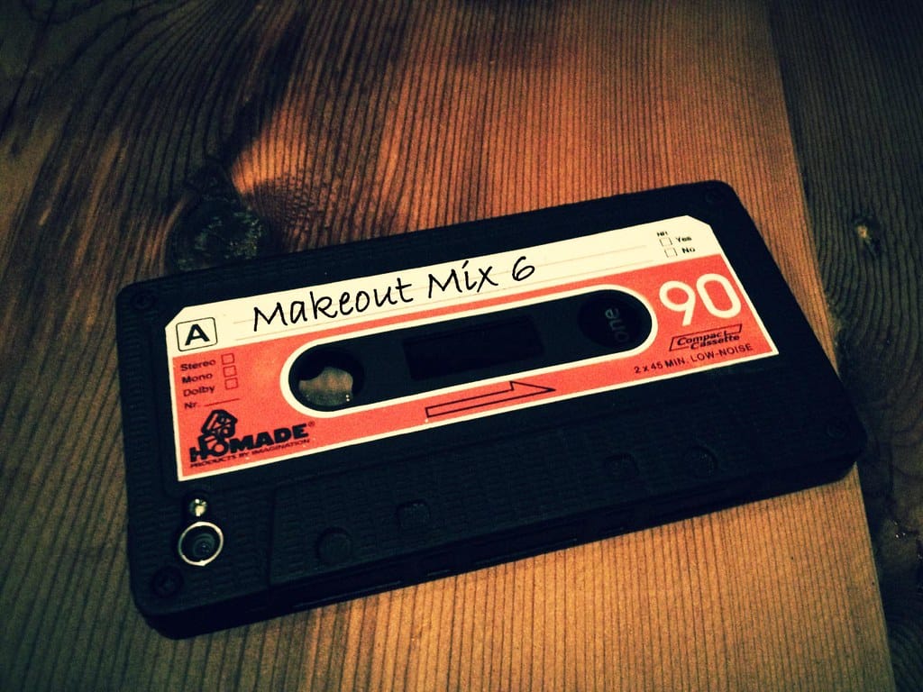
You could tell a lot about a person before the tape even got to side A. Not from the songs - from the label.
The Brother P-Touch PT-65 hit shelves in the early 90s and it changed the whole diplomatic language of the mixtape. Suddenly you could run a strip of embossed plastic tape through a little dot-matrix printer and get clean, uniform, almost corporate lettering on the spine of a cassette case. It looked serious. It looked like you had put in effort that wasn’t just emotional - it was technical. Some people found that thrilling. Other people found it deeply suspicious.
Because the ballpoint pen was the original interface, and it was not going anywhere without a fight. Block letters pressed hard enough to dent the paper insert, sometimes bleeding through to the back where the second side’s track list lived. A slight list to the right if you were left-handed and rushing. Song titles abbreviated because you ran out of room on line four and had to cram “WHERE THE STREETS HAVE NO NAME” into a space built for eight characters. That struggle was the point. Nobody handed you the struggle - you generated it yourself, at your kitchen table, with a Maxell XLII case open in front of you and the plastic still smelling faintly of shrink-wrap glue.
The P-Touch crowd read as tidy. Organized. Maybe even a little cold, depending on who was judging. If a girl in your grade handed you a tape with a label typed in that crisp tape-cassette font, you clocked it immediately as a different kind of gesture than the one where somebody’s handwriting wobbled with the pressure of writing on their actual knee because there wasn’t a hard surface around. The P-Touch tape said I thought about this and executed a plan. The handwritten tape said I felt something and didn’t have time to think about how it looked.
Both were compliments. They were just different compliments, and everybody with a boombox and a functioning nervous system in 1988 knew which one they were getting and adjusted their reaction accordingly.
There was a middle tier too, and it mattered just as much: the label typed on a home computer, dot-matrix printer, cut out with scissors along a line that was never quite straight. That one said something else entirely - it said your house had a computer, which in certain zip codes in certain years was its own kind of flex, separate from the music entirely. A Commodore 64 or an early Mac SE putting out perforated tractor-feed paper with a track list on it read as aspirational in a way neither the pen nor the label-maker could touch.
None of this got said out loud, obviously. Nobody sat across a lunch table and announced, “I read your penmanship as evidence of emotional availability.” But the read happened anyway, fast and wordless, the second the case popped open. You clocked the label before you clocked the song list. Sometimes the label told you more than the songs did, because song choice could be borrowed - somebody could tip you off to what was cool that week - but handwriting couldn’t be faked, not convincingly, not by a teenager without the patience for forgery.
The label was also the only part of the tape immune to magnetic decay. Songs could drop out, azimuth could drift, the leader tape could stretch and warp a chorus into a slow-motion horror show. But the ink stayed put. The label-maker tape survived hotter glove compartments than the handwritten one, too - that P-Touch tape adhesive held on through years of car heat that turned ballpoint ink the color of weak coffee.
Go dig through a shoebox if you still have one. Pop the case, listen to that satisfying little latch-click, and look at what’s written on the spine before you even think about the music. You’ll remember exactly who you were dealing with.
Which one were you - P-Touch precision or ballpoint chaos? And be honest: did you ever fake the other one to make an impression?